
Created a Head to Toe Branding Package for the Colby & Conrad real estate experience. They wanted multiple ventures under one name - so my main goal was creating a modular brand that showcases the core of their mission.


GOALS
Figure out the needs of my clients. They had no clue where to start.
Create a brand that is both unique as well as modular since the clients wanted many ventures under the same name.
Make every step as easy to follow along for my clients since they are self-admittedly "lost" when it comes to design. How do I turn their mission, thoughts and emotions into a brand?
RESEARCH
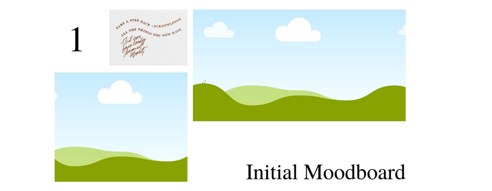
I first sent them a questionnaire and proceeded to meet with them to make sure we were on the same page. On this call we filled out the a very rough draft of how the brand might look.
It was important for me to have the presentation as bland as possible with placeholders to not give them too much information all at once.


IDEATION
After our call and their questionnaire, I was trying to narrow down aesthetic possibilities that would fit with their criteria. A new development made during the call was the need for the brand to be modular and expandable since multiple ventures would be falling underneath the Colby&Conrad umbrella.
Still keeping in mind their difficulty with not knowing what they wanted out of their branding, I put together a video explaining and showcasing some possibilities. It was incredibly important that they received the information separately and had some time to sit alone and develop their own opinions before meeting with me again.
DESIGN
Some time after the Ideation stage and hearing their thoughts, it was time to move forward with the information and start drafting out the branding. It started with a rough color palette and logo.
Colors
After a few iterations, I came up with a strong expanded color palette that could be used in a variety of ways. The overall concept for the color palette was to mimic nature since that is so prevalent to the brand.
The Neutrals - I opted for a neutral cream "Greige" and a deep cool brown "Earth" in place of the usual White or Black, respectively. This decision came from the softness and authenticity that is core to the C&C voice. It is a very subtle difference, however it leaves the subconscious with a sense of comfort compared to the typical stark contrast.
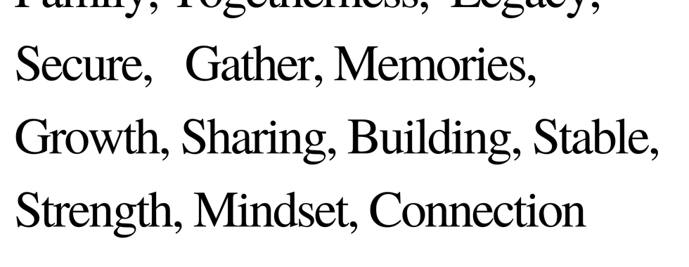
The Core 5 - These are the main colors expressed throughout their branding and will always have a place, regardless of use. "Ocean" and "Dandelion" are the only 2 colors the clients came to me with and they are the anchor for the rest of the colors. The concept behind the core 5 was a modern take on the primary colors - A deep navy, a pale yellow, and a soft pink - with 2 brighter colors that work well with the 3 primaries.
The Accents - These colors went through the most changes throughout the process. I ended with supporting colors that work well with the neutrals and the core 5.


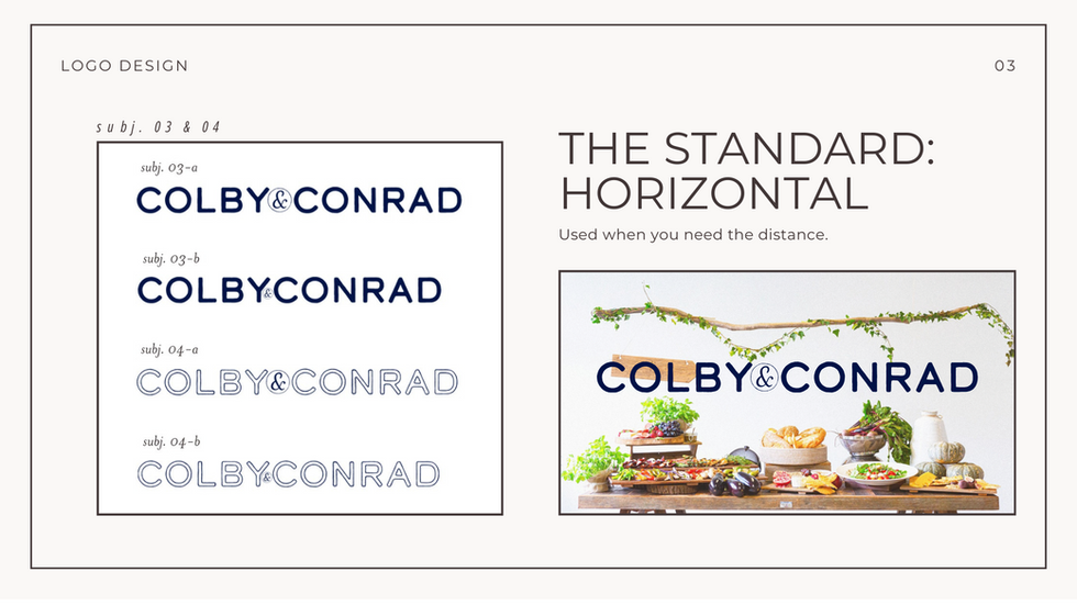
Logo
I created the logo by using 2 ready made fonts and designing it in a way that is easy to replicate for future uses.
My thought process was to have a bold sans serif font but with a rugged look.
I also added a more delicate font for the ampersand. However, I secured it in a circle to add more stability to the delicate font.


Fonts


Media


INTEGRATION OF DESIGN
Overall, I think the branding for Colby&Conrad will stand the test of time. I believe it fits well within their vision as well as their need for expansion.

Comments