

Mobile Application Centered around extreme accessibility for bus schedule planning. From concept to wireframes to user tests to high fidelity clickable prototype.
Contents
-
Overview
-
Summary
-
Roles + Responsibilities + Tools
-
Problem
-
Solution
-
Scope + Constraints
-
-
Process
-
Survey
-
Competitive Analysis
-
Audience + Persona
-
-
Information Architecture
-
User Flow
-
Site Map
-
Wireframe
-
User Testing
-
-
Design
-
Accessibility
-
Moodboard
-
Branding
-
Logo
-
-
Conclusion

Roles
Roles
Evelyn Moroyoqui
UX / UI Research & Design Lead
Tools
Figma
Google Forms
Notion
Zoom
Responsibilities
-
Managing Product Goals
-
Designating User Research
-
Information Architecture
-
Designing User Flows
-
Creating Visual Design
-
Prototyping
-
Conducting User Tests
-
Reiteration + Finalizing
Problem
Riders are currently complaining the most about the bus stop at Washington and State, which is served by seven bus lines.
Solution
The solution was to create an app that allows not only the user to easily find the right bus and schedule, but to make it completely accessible to all of our users.
Scope
1. Ensure that any rider can tell when each of the buses arrives at the Washington & State bus stop.
2. Ensure that all riders can tell how much time they have to get to the Washington & State bus stop before the bus they need arrives at that stop.
3. Allow riders to select one of seven bus lines to see a list of its future arrival times at the Washington & State bus stop.
Constraints
Time
I had a month to reach MVP standards from start to finish.
Target Audience
Working with our Target Audience added more days than planned to our research due to rescheduling and difficulty through Zoom.
Process

Competitive Analysis
Main competitors are Google Maps and CityMapper on mobile.
Strengths
Shows times and transfers for bus as well as different options
Weakness
Difficult to navigate routes.
Opportunities
Adding a stop option.
Make it more accessible.
Threats
Well known.
Local Competition.


Audience
Our goal is for anyone to be able to use BusPort. As for research, our Users had a form of disability.

Information Architecture
User Flow

Site Map

Wireframe

User Tests
Plan
I interviewed the participants that took my survey who seem like a good fit.
They ride the bus at least once a month.
Seem to have some disability due to the answers from the survey.
Likes the ability to use an app.
Report
Some users brought up having a vibrating & sound notification that will not stop until viewed in case they could not hear / feel it the first time.
All users expressed enjoying larger icons and buttons so that they can easily navigate the app.
All users with a walker/wheelchair said it was extremely important to know if a bus was accessible.
On the same note, hard of hearing/seeing users brought up adding buses that have screens and voice overs for each stop under the accessibility tab.
Design
Accessibility
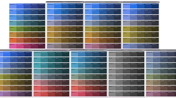
I did a lot of research looking for a universal color palette. To my surprise I never found one, so I created my own!
I found a color / contrast grid and used a filter for every type of color blindness over it. My concluding palette is shown in my moodboard & Branding guidelines.
Moodboard
After finding my color palette I needed to find a matching brand. When seeing the colors, I instantly thought of mid-century color blocked artwork which is simple and fairly high contrast. I also wanted the ability to show avatars and what better way to do so than with simple bold linework to keep with the high contrast goal.

Branding

Logo
For my logo, I wanted something incredibly easy to understand so we can carry out mission for simplicity and accessibility. I used a bold san serif font with a subtle contrast in the name so "Bus" is easiest to read. I surrounded it with a thick and rounded rectangle to mimic the legibility presented throughout the app.

Conclusion
Outcomes
After conducting user tests with the final prototype, all participants were able to complete the objectives.
All users had an easy time seeing information and navigating around.
Lessons
There was not a universal color palette.
Working with our target audience takes more time than usual.
Recommendations
-
Change all clickable assets to green.
-
Add the possibility to see how far the user is from the bus stop without adding a route.
-
Add in personal and general settings.
-
Add Wheelchair accessibility.
-
Add GPS option on splashscreen.
-
Add a tutorial at start (then available in settings).